I love designing and thinking about branding. I went to business school for my first degree and graduated into the world of finance, communications, and marketing. For a brief time, I even ran my own small business as a Digital Media and Marketing Consultant; it was my job to build the social media presence of local small businesses through targeted ads and personal branding. While I eventually moved on because I didn’t like the hustle, I did love the creative elements of my role.
I got to pour those same creative elements into designing logos for an imaginary library. Even though I’ve been focussing on a Mobile Makerspace, I decided not to try to build a logo for it because I would create a “Name This Space” challenge for students and build a logo based on their ideas. Instead, I made three for the full library, that would be used on the website, newsletters, and all LLC communications. I would love to hear your critical feedback:
What impression do each of these leave with you?
What kind of library or space do these make you think of?
What is missing or not hitting the mark for you here?
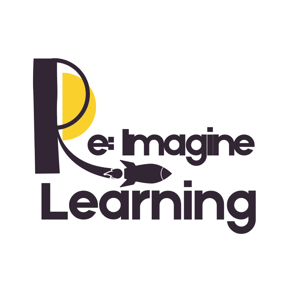
Logo #1: Re-Imagine Learning

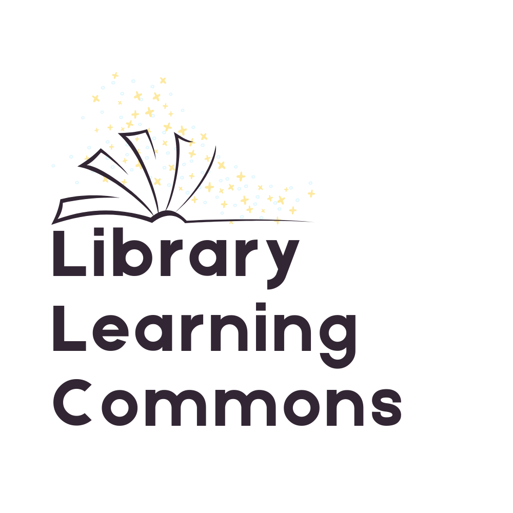
Logo #2: Library Learning Commons

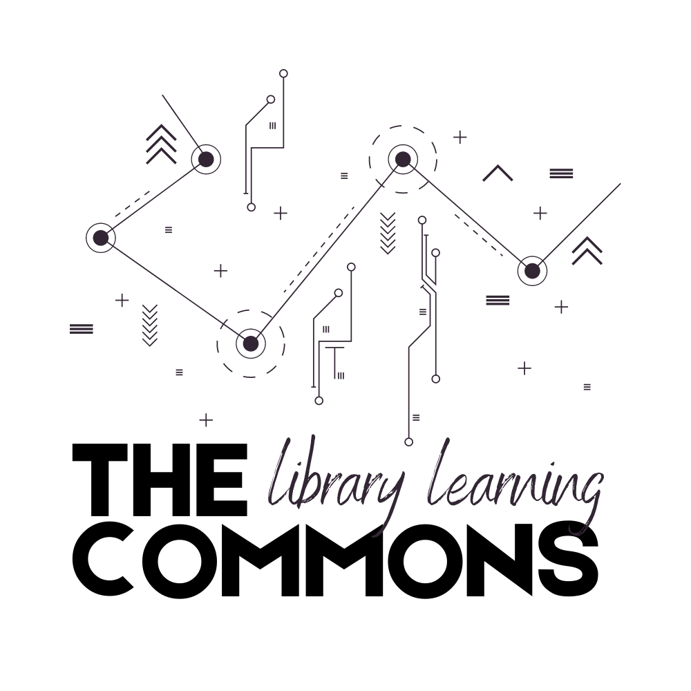
Logo #3: The (Library Learning) Commons

Hi Katrina,
These all look good for different reasons! 1 is my favourite but I am just curious about the logo purpose. Would this be the name of the LLC or the logo goes with the LLC sign, either above or below? Number 2 is simplistic and eye catching, I really like it! Is your LLCs purpose more of a reading/writing literacy focus? This feels like the vibe you’re going for. Number 3 looks really futuristic which would be great if your LLC leans more technology based. I am currious if the shapes could go around the writing? You did awesome with all of these.
Cole
Hey, this was more an exercise in developing logos, as I do not have a library to build a brand for, nor would I ever try to build a logo without knowing the library space, mission, people, and values. Your questions help me to read into your impressions of each logo and understand how they come across. Thanks 🙂
Hi Katrina,
Carrie Ann here.
Like Cole, the first is my favourite. It just pleases my eye, has great ‘energy’ and simplicity, and also contains a bit of a surprise (rocket) and an invitation (re:imagine)… and the word imagine also makes it a bit magical. I think would be GREAT branding, but then I think the space would also need a name, probably with it’s own font/logo? Perhaps this is like the slogan and the name would be in similar style? Or Learning Commons written sideways up the left side?
The second I like, but the book/stars focussed does seem traditional literacy focussed… maybe good for elementary?
The third I really like and the tech aspect is cool… but it feels almost more university to me… like a little bit ‘cold’/modern/cool innovation, not so warm and safe feeling, which I think would be an important vibe for you in your school library.
Too much feedback?
They are all gorgeous.
I’ve learned so much from you about good design, even in our short chat.
I love this feedback! Thank you for sharing how these impact you and make you feel. It would be really cool to be able to work on branding for a library one day. Unlike this assignment, however, I would make it a school-wide initiative in several steps, starting with name, then graphics, colours, and finally a vote on the top 3.